New Map Reveals How Airbnb Has Transformed Your Neighborhood
June 26, 2015, 3:23 p.m.
Gentrification porn for all.

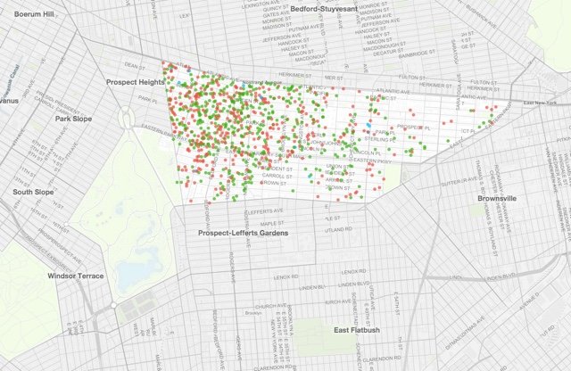
Behold, the Airbnb listings of Crown Heights
Bed-Stuy-based photographer Murray Cox has used his coding skills to collect all of the public information associated with every single Airbnb listing in New York City, and arranged it on a searchable bird's eye map. "There are 1,500 listings in my neighborhood," he told us. "I decided to present this data on a map so that people can start to relate to it."
Cox is not, he's quick to tell you, affiliated with New York's controversial sharing economy app. Rather, "By analyzing publicly available information... Inside Airbnb provides filters and key metrics so you can see how Airbnb is being used to compete with the residential housing market."
Take Crown Heights, for example. Of the neighborhood's 839 listings, 46.8% are for entire apartments, and a third of them are managed by hosts who are juggling multiple listings. For Cox, these signs point to fishy behavior; these hosts are "more likely to be running a business," he says.
Inside Airbnb first launched in February, but a 2.0 version that debuted this month covers all of New York City's Airbnb listings as of June 1st. A quick glance shows that, despite the city council's best efforts to stem the flow of Airbnb abuses, 53% of the city's 27,469 listings are rented out for more than 60 nights per year, and 30% of them are managed by hosts who have more than one Airbnb listing to their name.
For many of them, it's a lucrative gig. Back to the Crown Heights map: Romero, a multi-listing host, rents an apartment near the corner of Eastern Parkway and New York Avenue that rakes in more than $4,000 a month (the map will link you directly to his Airbnb page.)
"There are certain points of data that you have to make assumptions about," Cox admits. For example: "There is no metric on Airbnb's website that tells you how many days per year a room is rented. So you look at the total number of reviews posted in a certain time period." A disclaimer on the website points out that, because not all users leave reviews, these estimates are likely on the conservative side.
Using the map's search feature, you can roam around your own neighborhood, and click on the pin-dropped listings in turn: red for entire-home listings, green for private-room listings, and blue for unicorn-status shared-room listings.
For gentrification disaster porn, we suggest Williamsburg. For those feeling claustrophobic, check out Williamsbridge.