MTA Unveils New Digital "Live Subway Map" To Simplify Service Changes
Oct. 20, 2020, 2:21 p.m.
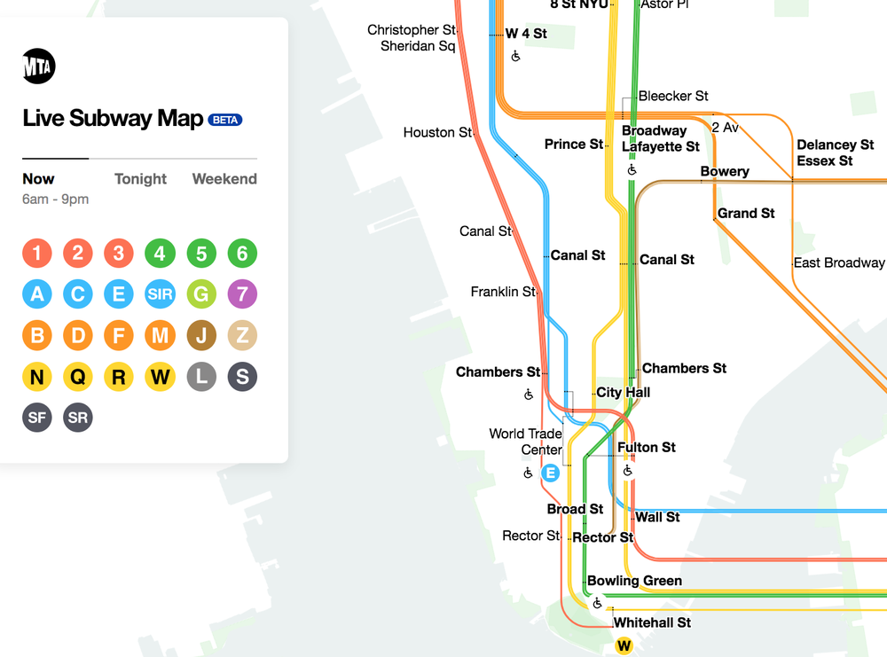
The MTA Live Subway Map seeks to transmute the weekly onslaught of confusing and byzantine service changes into one simple-to-use app.

The MTA unveiled a new digital subway map to the public on Tuesday, one which seeks to transmute the weekly onslaught of confusing and byzantine service changes into one simple-to-use map.
The MTA Live Subway Map, which goes live today and also replaces the Weekender app, will have real-time updates to help straphangers navigate the subway system, plan out their commutes ahead of time, and literally be able to watch subways move around the system on their phones.
Sarah Feinberg, interim president of New York City Transit, said it was a much-needed tool to make the subway more user-friendly and convenient as the MTA tries to lure people back to mass transit: "We have to be proactive in providing customers with additional tools that simplify the system and its many overlapping lines," she said at a press conference on Tuesday. "No longer will people have to decipher a range of in-station signs. You can plan your commute from the palm of your hand."
The live map was created in partnership with digital product agency Work & Co. and public-private initiative Transit Innovation Partnership. The project was first sparked by Sarah Meyer, NYC Transit's chief customer officer, who brought up the need for a streamlined way to communicate service changes with customers in 2018, soon after she took over her position.
Work & Co., who worked on the project pro bono, created the actual map, which currently works as a standalone site you can access here on your phone or desktop, but not (yet) in the MTA's app. If you pinch your fingers together, it offers a zoomed out view of the various lines aligning with the standard 1979 Michael Hertz map; if you drag your fingers apart on your phone, you can zoom in and see the trains actually moving in a map that includes aspects of the very popular 1972 Vignelli map. If you click on a station, you can see real-time updates on train arrival times, plus get the info about service changes, elevator and escalator availability, and more.
If there is a service change, you should see an exclamation point on the home screen next to the line affected; the line should also physically change when you zoom in closer, so you can check before a trip—especially on weekends and at night, when service changes are most abundant—to see whether trains are stopping at your station or if a different train is running through it.
"Together, we've helped merge the beloved features of the Vignelli map and the Hertz map in a way that can now show planned service changes holistically and accurately," Meyer said. "This new tool blends form and function in a beautiful and innovative way."
If you want to know more about the nitty-gritty, skip to the 21-minute mark in the video below, and you can watch Felipe Memoria, founding partner at Work & Co., offer a demonstration of using the map and app.
The MTA touts this as a first of its kind in North America, and possibly the rest of the world. They stressed that the app is still a beta product, and they want customer feedback and suggestions to keep improving it.
Several people have already been demoing it for a few weeks now, including travel writer Jason Rabinowitz, who told Gothamist that while the map isn't perfect, "it's a huge step forward in communicating the often nearly incomprehensible service changes. It's one thing to attempt to read the service changes, but it's way more helpful to actually visualize, especially for infrequent riders or tourists who aren't familiar with the system and don't instinctively know what 'The N runs on the Brighton Express and Broadway local this weekend' means."
Ben Fried, a spokesperson at TransitCenter, agreed that it will be most useful for checking service advisories and outages, and added that it had a few other perks, including that elevator and escalator availability info. However, he said it still had some kinks that needed to be worked out: "I sometimes had to reload to see the flashing icons for lines with service disruptions," he said. "The navigation felt pretty intuitive to me, but was not reliably responsive to the touch on my phone screen."
As of now, you have to go to the website to access it, but Meyer noted during today's press conference that their "first priority is to integrate it into the MYmta app."
Additional reporting by Stephen Nessen