How a color-coding system changed NYC's subway map forever
Feb. 11, 2023, 12:01 p.m.
Color-coding the subway map has been key in helping people better understand and navigate our city. But it was the end result of years of various designers and cartographers tinkering with disparate concepts.
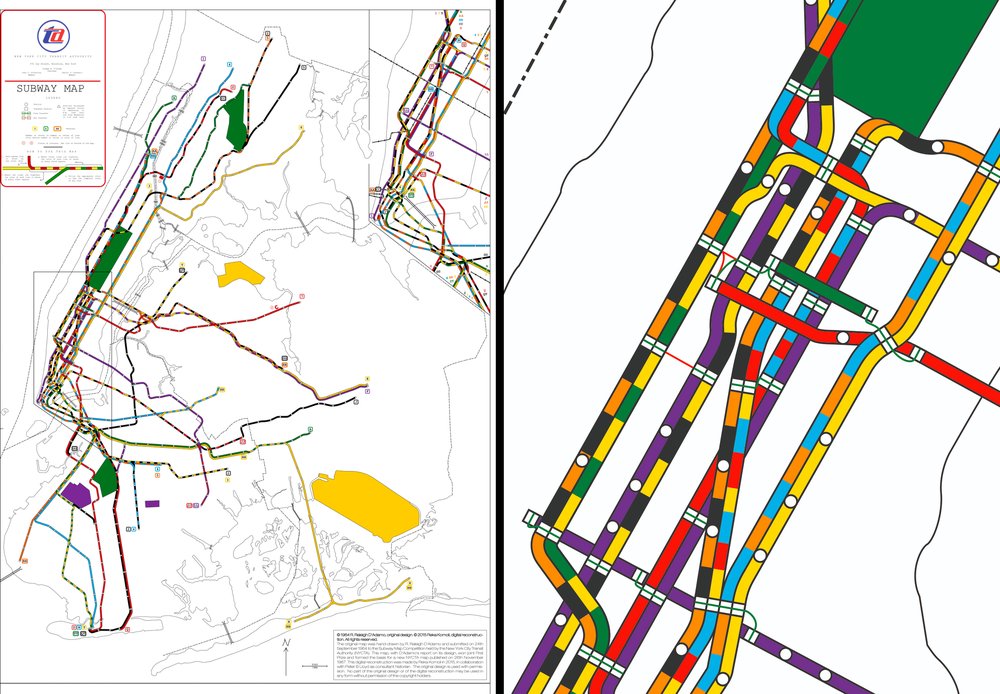
Some cultural debates are lodged into our collective consciousness: Beatles versus Stones, “Star Trek” versus “Star Wars,” Coca-Cola versus Pepsi. For New York City transit buffs, it's about which subway map is superior: Massimo Vignelli's diagrammatic, aesthetic '70s map, or John Tauranac's geographic one. The matter is far from settled: Tauranac's vision is still largely used today, but Vignelli's design is tapped for merchandising opportunities and app development.
The debate hinges on philosophies of communication and graphic design, as well as how one feels about the role of a subway map. Is it better to be minimal and only include information that will help you get from point A to point B? Or should it act as a more holistic guide, showing the relationship of NYC landmarks to the stations?
Both maps resulted from years of various designers and cartographers tinkering with disparate design concepts. And neither would be coherent were it not for a color-coding system developed over the course of decades.
According to historian Peter Lloyd, color-coding the map has been key in helping people better understand and navigate the city.
"The New York subway system has multiple layers of information,” Lloyd said. “When you try to map it out, it's not simply laying out the lines on a sheet of paper. The color is an easy way for people to absorb that complex information."
Lloyd co-authored "Vignelli: Transit Maps," and is working on a series of books tracing the history of subway maps. On Feb. 11, in a Transit Museum presentation titled "Coloring the Subway Map," he’ll discuss the genesis of the color-coding system, and how and why it shifted over the years.
A fragmented beginning
Three separate companies originally operated subways within the city: the Interborough Rapid Transit Co., or IRT, which opened in 1904; the Brooklyn-Manhattan Transit Co., or BMT, which opened in 1923; and the city-owned Independent Subway System, or IND, which opened in 1932. Each produced its own maps, most of them incorporating some color elements. In the mid-1930s, the Hagstrom Map Co. sold maps that displayed all three networks on one page for the first time.
In 1940, all three companies amalgamated as one city-run body, the Board of Transportation. In need of a map, they initially chose Hagstrom’s version, which was then distributed from token booths.
Only three colors were used on those early maps: blue for the IRT, red for the IND and orange for the BMT. By the late 1940s, the BMT had switched to yellow.
Some have speculated whether those initial colors were influenced by the colors of the subway mosaic tiles that indicated sections of the network. But Transit Museum curator Jodi Shapiro says there's no known correlation.
Over the next 20 years, those three colors remained consistent. Then in 1958, the Transit Authority hired George Salomon to produce its first in-house subway map. Salomon, a graphic designer, had submitted an unsolicited proposal for overhauling the map and the nomenclature of the entire system.
Shapiro said Salomon suggested assigning different colors to differentiate the trunk lines from one another. In his proposal, "Out of the Labyrinth," he submitted designs for five lines, and even mocked up a sample map. For reasons unknown, the Transit Authority didn't use the colors in the official 1958 map.
![George Salomon, [Map prototype from Out of the Labyrinth], 1957-1958, 2002.38, New York Transit Museum](https://images-prod.gothamist.com/images/2002_38_p24.width-1000.jpg)
A colorful innovation
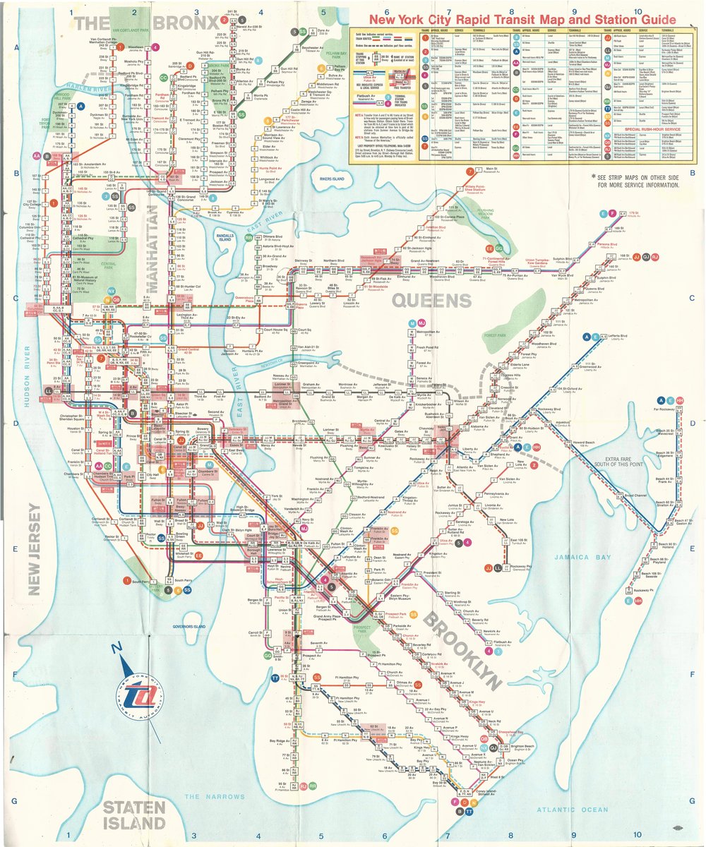
The Transit Authority knew that by the end of the 1960s, the Chrystie Street Connection, a 2 mile tunnel underneath Chinatown, would connect the IND and BMT networks for the first time. The red and yellow lines would no longer be separate, which meant a three-color system would no longer suffice.
In anticipation, the Transit Authority launched a public competition in 1964, asking people for map design suggestions. Three winners were selected, but only the design made by Raleigh D'Adamo, then a practicing lawyer, was implemented.
"For better or for worse, I guess I'm the one who really upset the apple cart back in 1964 with that map contest," D'Adamo said. "I thought it was the perfect opportunity to press for getting rid of the three colors and making some sense out of the system."
Instead of a separate color for each of the three operating networks, D'Adamo proposed a system of one color per route. "I said, I'm not a professional cartographer, [but] it's just time to get rid of the three colors and color-code each route,” he said, “so that a person can trace it from one end to the other very easily.”
The contest rules specified that the submission had to be geographic. D'Adamo traced over a map from the New York City Planning Commission, reproducing the whole layout from the Bronx to the Rockaways.
D'Adamo, a hobby letterpress printer, picked seven primary colors. Through a long process of trial and error, he assigned colors to each of the routes, favoring the "flagship lines" through Manhattan (whichever lines had the most number of stations). He ultimately landed on a solution where two adjacent routes couldn't be confused with one another.
Once his idea was accepted, the concept went through several prototypes by different people until it landed in the hands of Dante Calise, an accountant manager for the company that printed the maps. Calise chose which colors went with which lines.
The Vignelli map
The map inspired by D'Adamo, which was finally released in 1967, was the first on which each route was shown separately. Yet despite the color-coding innovation, the map was not a hit with the public — or even with D'Adamo.
The layout was messy and overly busy, stuffed with white rectangles, confusing intersections of routes and transfer points, and random reddish-colored boxes.
"When I saw it, I almost cried, because it was such a horror show," D'Adamo said. "It looked like somebody threw a box of strawberries at the map."
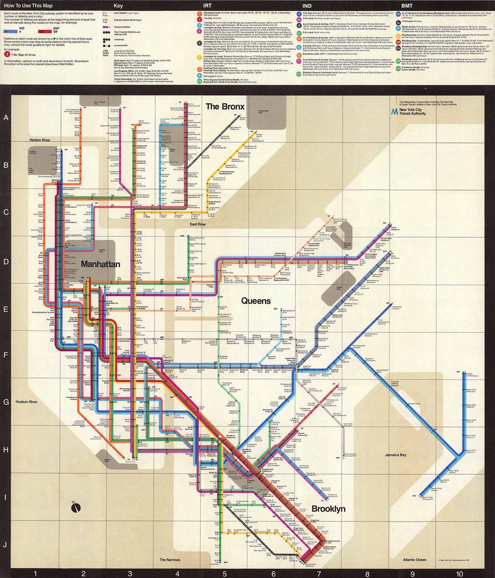
At the same time, the Transit Authority had hired the design company Unimark, whose New York office was headed by Italian designer Massimo Vignelli, to redesign signage in the subways — the first visual attempt at unifying the system. Impressed with their work, the Transit Authority asked Unimark to redesign the subway map around 1970.
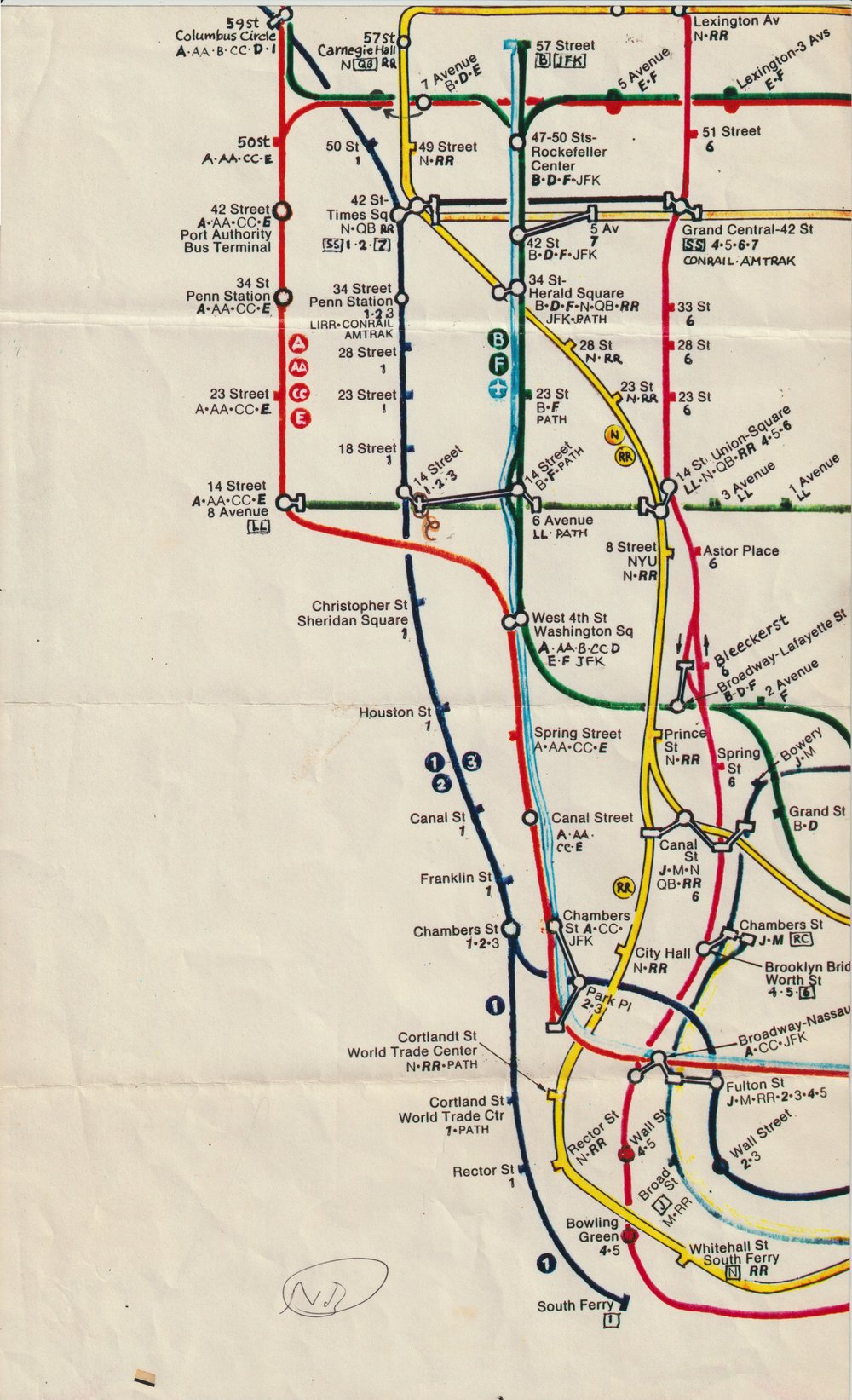
Vignelli kept the colors Calise had devised but did away with the messy line interruptions. His route-colored map, with its rounded, rainbow-tinged diagrams, was released in 1972, and was an immediate hit among designers.
D'Adamo was in awe. "I said, my God, if I had Massimo's genius, that's exactly the map that I would've produced," he said. "In essence, he really perfected the concept that I had in mind."
The Tauranac map
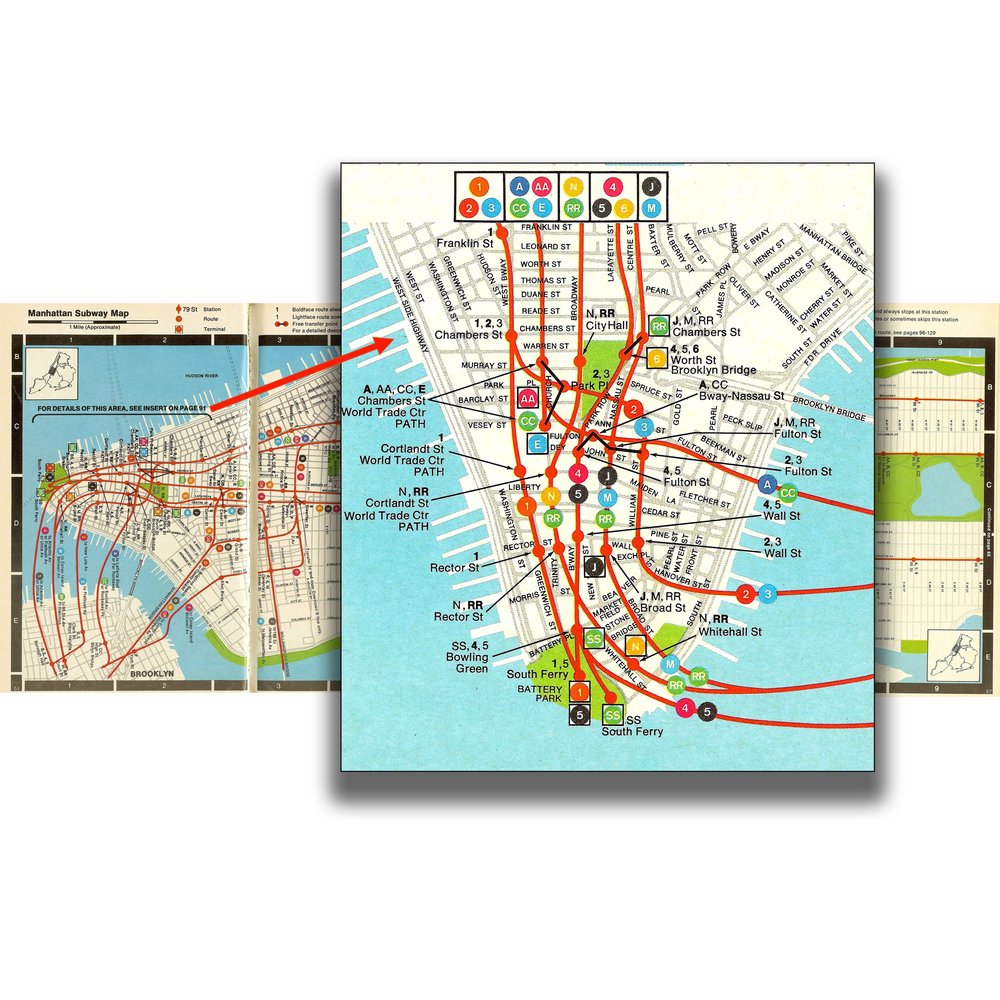
But the Vignelli map had its detractors: some straphangers at the time described it as "confusing." The locations of certain stations were altered to better fit the grid, and the distances between stations were not to scale. People would get off at some stations and find out they were several blocks away from where they thought they would be.
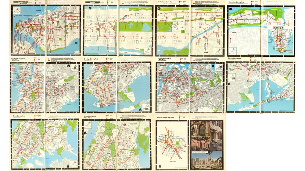
New York City was on the brink of bankruptcy in the mid-'70s, and the MTA sought to boost ridership during normally slow times by encouraging people to use the subway for leisure and shopping. In 1976, they hired John Tauranac to help produce "Seeing New York: The Official MTA Travel Guide,” which included a truly geographical subway map. The first version spanned 21 pages of the guidebook.
Tauranac, a licensed NYC guide who had written guidebooks for the MTA’s Culture Bus Loops, had a different approach.
"Vignelli believed in a minimal system; as far as he was concerned, the subway map was just a tool for navigating," Lloyd said. "John Tauranac felt the map should be what he called 'didactic.' It should tell you about the city, tell you where the parks are, tell you where the piers are – all the stuff you don't need for the subway, but tells you about the city."
Tauranac was blunt about how he felt about the prior map: "From the moment that the Vignelli map had been published, I hated it," he said.
He says he was given “carte blanche” by the MTA to create a new subway map, and the first change he wanted to make was to drastically simplify the color-coding system. "I was advocating that it would be modeled on the London Underground trunk line system,” he said. “The TA put the kibosh on any plans to change [that] because it would've been enormously expensive. They said that there shouldn't be an MTA travel guide with one set of colors that didn't jibe with all the rest of the colors in the system."
Tauranac was put in charge of the MTA Subway Map Committee, which was tasked with creating a map that would appeal to visitors. They tested a prototype in 1978.
"Overwhelmingly people liked the idea of a geographic approach over schematic,” Tauranac said. “But they said we need a better color-coding system."
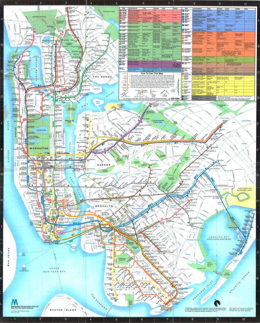
The big innovation was simplifying the Vignelli map by designating a different color for each trunk line. On Lexington Avenue, for example, there are three different routes: the 4, 5 and 6. On the Vignelli map and the one before it, each had its own color. Tauranac merged them together in one hue, branching them off at the top and bottom.
Tauranac felt that his map couldn't work without the new color-coding system. Just before Labor Day weekend in 1978, he met with Phyllis Cerf Wagner, head of the MTA Aesthetics Committee, who asked to see samples. Most of the design work was done that holiday weekend by Nobu Siraisi, who worked at Michael Hertz Associates. He came up with a half-dozen different rough drafts showing the new color-coding system.
Once Wagner saw the mockups, she was able to intervene with the MTA heads, secure funds and lock in the map, which was officially adopted by June 1979.
What comes next
In recent years, the MTA has been increasingly willing to experiment with incorporating various kinds of maps to offer riders more visual options. It also unveiled a Live Subway Map as part of its Weekender app, which gives straphangers real-time updates.
Lloyd, the subway map historian, thinks that outside of an electronic map, which offers so much more capacity for information, there's no way to chart the system completely.
"We can never truly map the subway with a single sheet of paper – it can't be done," he said. "There's too much information there, which changes over the daytime versus peak versus evening versus nighttime and the weekends. So the idea of having a perfect map is just a dream."
The Transit Museum's “Coloring the Subway Map” event, on Saturday, Feb. 11 at noon, is sold out. Lloyd will be talking again at the Transit Museum in the spring — you can sign up for the NYTM newsletter to stay up to date.